
Gemini App’s New Colorful Icon Enhances Your Smartphone Experience
If you’ve glanced at your smartphone’s home screen lately and felt something looked just a tad different, you’re not alone. The familiar face of Google Gemini has recently had a bit of a makeover—and let me tell you, this one’s hard to miss if you’re used to its previous look. Whether you’re an Android devotee or prefer iOS, there’s a fresh splash of colour now perched amidst your apps. I’ve had the chance to live with the new icon for a few days, and I have to admit, it’s managed to both please my eye and make navigating between Google’s services noticeably simpler. In this post, I’d like to share my own take on the new Gemini icon, how it fits into Google’s broader visual identity, and what it means for your day-to-day use.
A Fresh Lick of Paint: Google’s Vibrant Colour Palette Arrives on Gemini
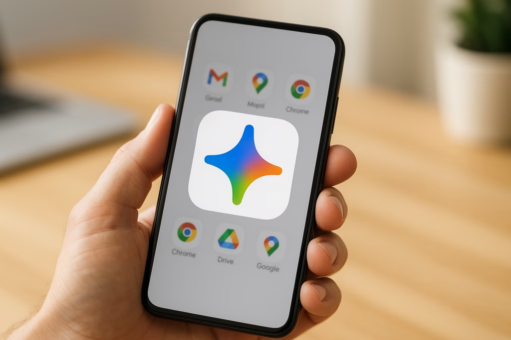
The most striking difference you’ll spot is the move away from the older, somewhat somber Gemini symbol toward something far more vibrant. The new icon is instantly reminiscent of other Google stalwarts. If you’re anything like me and can never quite resist a neatly arranged home screen, you’ll probably spot this shift right away: blue, red, yellow, and green now radiate from the icon, echoing Google’s unmistakable chromatic signature.
What’s New in the Gemini Icon?
- Four signature Google colours: Rather than sticking with one dominant shade, Google’s brought in the same four colours that define well-known applications like Maps, Gmail, and Chrome.
- Rounded, friendlier shape: Gone are the sharp edges and thin lines. Now, a gentle, almost inviting curviness draws you in, with the icon’s rounded corners making it feel right at home among other Google apps.
- Navigable gradient: A subtle gradient softens the icon along its left edge, imbuing it with a kind of tactile depth you can almost feel. There’s a real polish to it; on my own device, the difference stands out immediately.
- Blue in the spotlight: The right side is especially heavy on blue, while the other colours form rounded accents. For visual folks like me, this helps the icon pop just enough without overwhelming the senses.
From my perspective, this new look brings a bit of cheer to my screen, particularly when the day’s been long and I just want things to be bright and simple. It’s a small nod to visual harmony, but I rather fancy the way the new Gemini icon sits alongside other Google products now.
Improved Visibility for All Screens
There was a time—maybe you remember this—when app icons would blur together, especially as screen technology improved and pixels got ever denser. Thin lines, dark hues, and minimalist flourishes sometimes got lost in the shuffle, to the point that I’d find myself tapping the wrong app. Not exactly a productivity booster, right?
What Difference Does the New Icon Make?
- Larger, more distinct presence: Google has expanded the core shape of the Gemini icon within its background, allowing it to fill out the white circle more effectively. So, even if you’re using a compact device, you can pick out Gemini at a glance.
- No more vanishing lines: Those fiddly thin lines are gone. The icon no longer suffers from the ‘where-did-it-go’ effect I’ve seen with previous iterations on high-resolution screens.
- Sharper at tiny sizes: Whether you shrink your icons down or use default settings, readability is retained. The new design means I’m not squinting quite so much when scanning a crowded home screen.
I’m the type to keep my apps well-organised—and, let’s be honest, probably more than a little bit obsessed with aesthetics—so I appreciate this kind of subtle but impactful update. Spotting Gemini among a dozen-odd icons is, quite simply, easier now.
Cohesion Within Google’s App Ecosystem
Consistency matters, even in the world of tiny visual cues. By bringing Gemini’s iconography in line with its more established siblings, Google ensures you won’t mistake one type of service for another, but you’ll always have a sense of belonging across the board.
Gemini Joins the Family
- Uniform colour story: Every major Google app now “speaks” in the same visual language. Whether it’s Docs, Drive, or Chrome, you’ll see an echo of those signature hues, suggesting—somewhat quietly—that these tools are all connected.
- Unmistakeable individuality: Despite the brand unity, Gemini’s “sparkle” motif ensures it remains recognisable, even if, like me, you’ve grown attached to the app’s unique aesthetic.
- Less hunting, more doing: The consistency really streamlines daily routines; there’s something comfortingly familiar about reaching for an icon that just looks “right” with the others.
There’s a certain delight in seeing everything fit together so perfectly on the screen. It brings to mind the old saying—“birds of a feather flock together”. And, truth be told, it just feels more professional when the software you rely on looks as though it was made to work seamlessly together from the start.
Functional Updates Alongside the Visual Revamp
Of course, Google hasn’t just changed how the Gemini app looks. There are under-the-hood tweaks, too, especially for those among us who love shortcuts and efficient workflows. The app’s latest updates cater nicely to both Android and iOS users, bridging feature gaps and giving each cohort something to crow about.
Android: Smarter Widgets at Your Fingertips
- Redesigned widget layout: The widget is less cramped and more thoughtfully spaced. On a larger widget (say, 3×3), you can access up to eight shortcuts—everything from typing and voice commands to camera, gallery, file sharing, video chats, and now the new Gemini Live feature.
- Quick access to essential tools: Features like video calling or screen sharing are now only a tap away, something I’ve found invaluable whenever I’m juggling tasks on the fly.
iOS: Powerful Conversation Search
- Chat search built in: You can now find previous conversations in a snap, great for folks like me who tend to rely on their device as a running logbook.
- Improved user navigation: Getting back to an old chat or finding a critical piece of information has become less of a headache; a small but not insignificant win.
From my experience, there’s a real sense of effort behind these tweaks. The Android widget, in particular, has become a highlight in my daily workflow—less sprawling, more effective. I haven’t had a chance to fully explore every new shortcut, but so far, each feels like a useful addition rather than clutter. If you work with AI conversations often, these refinements are bound to shave seconds—if not minutes—off your day.
When You’ll See the New Icon on Your Device
For many, the new Gemini icon has already landed—both on Android devices and iPhones. If you’re a web Gemini user and tend to access the app through a browser, the update may not have reached you just yet. I’d wager it’s only a matter of weeks until the makeover appears there as well, knowing Google’s roll-out style.
As for those of us who love knowing we’re on the cutting edge, it’s well worth updating your app if you haven’t already. That way, you get both the snazzy new visuals and the functional perks without delay. And let’s be honest: who doesn’t enjoy that little tingle of satisfaction only a refreshed app icon can deliver?
Small Changes, Big Comfort
At first glance, this might all seem rather cosmetic—a fresh coat of paint on a digital front door. Yet, the cumulative impact is difficult to ignore. Finding the app amongst a wall of icons is easier, the new look lends a sense of coherence to Google’s suite, and the small accessibility boosts pay off throughout the day. I’ve found myself hunting less; instead, everything feels that bit more polished and ‘at home’.
Why Visual Consistency Matters for Users
- Easier app recognition: Rapid identification means fewer mistakes, less time spent scanning, and a smoother experience—especially for anyone juggling multiple accounts or devices.
- A sense of order and calm: For those of us with a fondness for a tidy home screen, the harmony between apps nurtures a tiny sense of satisfaction.
- Unified brand experience: It may sound a bit dry, but, honestly, having everything “match” delivers an elegant touch that upgrades the overall experience.
This attention to detail—though minor in the grand scheme—really lifts the daily interactions we have with our tech. I’ve always been a proponent of thoughtful design, and this feels like a step in the right direction.
Gemini’s Visual Journey: From Subtle to Smartly Bold
For the history buffs and design aficionados, it’s interesting to see just how far the Gemini icon has come. Not so long ago, it flew under the radar, almost melting away into a sea of dark app logos. The shift toward bolder, more expressive colours signals a wider move by Google to make their services not just functional but also instantly accessible—at a glance, even for the less digitally savvy among us.
If you’re curious as to how this fresh iconography stacks up against others, consider the way flagship apps like Maps, Gmail, or Chrome—each easily recognisable by distinct colours and forms—have become part of a wider visual “language.” The idea is simple: clear, familiar visuals help you orient yourself without a second thought.
How These Updates Reflect the Wider Trends in App Design
App design has matured considerably as our devices have become central to our lives. You might remember those days of drab, uniform app icons—a lost art that, frankly, no one misses. Today, however, design is equal parts artistry and function. It’s all about clarity, approachability, and making the everyday just a little more delightful.
- User-centred design: The new Gemini icon fits right into the trend of “designing for people.” It’s bolder, more accessible, and recognisable at the blink of an eye.
- Visual unity across ecosystems: By sharing colours and theme elements, Google’s apps now provide a genuine sense of community—a visual shorthand for quality and reliability.
- Prioritising accessibility: Larger, clearer icons don’t just look smart—they help users of all ages and abilities feel more at ease. For me, there’s real peace of mind in knowing I won’t need to hunt for my favourite apps.
This isn’t just about visual appeal; it’s a sign of how attention to the smallest details can build loyalty and trust. I know I appreciate it—don’t you?
Practical Tips: Making the Most of Gemini’s New Look
If you haven’t done so already, now’s a fine time to pop into your app store of choice and grab the latest Gemini update. Once you do, there’s more to explore than just a shiny new logo.
For Android Users
- Try out the widget: Make full use of the redesigned Gemini widget. Arrange it where you’ll benefit most: on a custom home screen, inside a productivity folder, or wherever your workflow takes you.
- Familiarise yourself with new shortcuts: Spend a few moments tapping through the new quick-access links. If you’re in the habit of switching between messaging, sharing files, and video calling, it will quickly become clear how much time this saves.
For iOS Users
- Get comfortable with conversation search: Start using the new chat search and set aside older, slower habits. Retrieving critical data or old threads is now easier than ever.
- Keep your app up to date: Apple’s ecosystem is known for its polish—keeping Gemini updated will ensure you benefit from all the latest features as soon as they land.
My routine has definitely smoothed out with these changes—I no longer find myself poking around in search of a recent conversation. For anyone tuned into efficiency and productivity, it’s a welcome improvement.
Reflections: Why These Details Matter in the Long Run
Tiny details have a habit of slipping by unnoticed—at least, until they change for the better. In the case of the Gemini app’s new icon, the changes might seem minuscule at first, but over time they add up to a much more comfortable and engaging experience. You’ll find yourself spending less time hunting through icons, and more time getting things done.
What’s more, this commitment to consistency signals something important about Google’s direction. There’s a whiff of professionalism to it, a sense that these aren’t just tools thrown together, but aspects of a thoughtfully curated ecosystem. I, for one, get a little boost of confidence every time the apps I use feel as though they actually belong together.
What to Expect Next: The Road Ahead for Gemini
With these recent improvements, Gemini firmly establishes itself within Google’s larger family. But if the company’s track record is anything to go by, further refinements are likely just around the corner. We might soon see the same icon adopted for web users, more widget options, or even subtler tweaks to how the app integrates with other Google services.
My advice? Stay updated, explore the new features, and enjoy that little dose of clarity and joy each time you tap open the Gemini app. After all, a cheerful screen makes the whole digital experience that bit lighter.
Conclusion
The Gemini app’s updated icon is more than just a visual refresh. It’s a nod from Google towards greater consistency, accessibility, and, yes, a little bit of playfulness in how we interact with our digital tools. As someone who spends a good slice of the day zipping in and out of Google’s ecosystem, I genuinely appreciate this kind of detail. If you give it a try, I’m confident you’ll feel the difference—subtle maybe, but meaningful all the same.
If you haven’t yet updated Gemini on your phone, now’s the perfect opportunity. Trust me, a simple icon refresh could be one of those small digital pleasures you didn’t know you were missing.
Key Takeaways
- Gemini’s new icon now features Google’s trademark blue, red, yellow, and green colours, with a dominant blue accent.
- Visual consistency with other Google apps makes for easier navigation and a more unified home screen.
- Functional enhancements include improved widgets and shortcut options, as well as conversation search features for iOS.
- Clearer, larger icons boost accessibility and ease of use for all users.
- Staying updated means getting the latest benefits, whether you’re on Android, iOS, or soon via the web.
As the saying goes, you can’t judge a book by its cover, but a handsome new cover doesn’t hurt either. Don’t wait—update your Gemini app and see the colourful difference for yourself.