
ChatGPT Images 2.0: Mastering Complex Visual Tasks with Precision
I work in marketing long enough to spot a pattern: the teams that ship reliably aren’t always the “most creative” ones. They’re the ones who can turn an idea into usable assets—quickly, repeatedly, and with fewer hand-offs. That’s why the announcement of ChatGPT Images 2.0 caught my attention. The promise is straightforward: an image model that handles complex visual work and outputs visuals you can actually use right away, with stronger editing and richer layouts.
If you run campaigns, support sales, or build business automations (like we do at Marketing‑Ekspercki, often with make.com and n8n), you know the pinch points: endless variants, inconsistent branding, last‑minute edits, and “can you also make it in 12 sizes by 4 pm?” requests. I’ll walk you through what this release implies for day-to-day marketing operations, how I’d test it, and how you can wire it into production workflows without turning your team into part-time prompt babysitters.
Note: I’m basing this article on the public announcement describing ChatGPT Images 2.0 as a high-end image model for complex visual tasks, sharper editing, richer layouts, and “thinking-level intelligence.” Since product details can change, I’ll stick to what’s stated and to practical, verifiable use patterns you can apply now.
What ChatGPT Images 2.0 Is (and What It’s Claiming)
The announcement frames ChatGPT Images 2.0 as a state-of-the-art image model capable of taking on complex visual tasks and producing precise visuals that are immediately usable. Three phrases matter for marketers and ops folks:
- Complex visual tasks — not just “make a cute picture”, but work that usually needs a designer’s attention: layout, hierarchy, multi-element composition, and edits.
- Sharper editing — changes to an existing visual without everything melting into a new scene.
- Richer layouts — more reliable composition: spacing, alignment, and structure that looks intentional.
When I read “immediately usable visuals”, I translate it into a practical question: Can your team use the output in a live campaign with minimal touch-ups? If the answer is “often, yes”, you’re not just saving design hours—you’re reducing coordination overhead, which is where timelines quietly go to die.
Why This Matters for Marketing, Sales Enablement, and Automation
In our projects, the bottleneck rarely sits in “ideas”. It sits in production: asset creation, variations, resizing, localisation, approvals, and version control. Image generation used to help mostly with concepts and mood boards. The new claim suggests we’re edging closer to a model you can run “in the loop” with campaign operations.
Marketing teams: from inspiration to production assets
Here’s what tends to happen in real life: you draft a landing page hero concept, your designer creates a version, then stakeholders ask for five variants, then your paid social lead needs a cut-down square version, then someone spots a product detail that’s outdated. If the model’s editing and layout fidelity improves, you can move a chunk of that iteration into a faster cycle.
Sales enablement: consistent visuals across the funnel
Sales teams live on decks, one-pagers, demo screenshots, and “quick custom slides” for a specific account. Image generation has been awkward here because brand consistency and accuracy matter. If the tool can do more controlled edits and follow layout instructions, you can build templates and produce consistent collateral with fewer manual steps.
Automation: asset factories that don’t feel like chaos
This is where it gets interesting for make.com and n8n users. If ChatGPT Images 2.0 outputs visuals that require fewer touch-ups, you can automate more of the chain:
- Generate a set of ad variants from a campaign brief
- Route outputs to a review queue
- Store approved assets with metadata
- Publish to ad libraries or send to the CRM
I’ve built similar “asset pipelines” before, and the hard part is always quality: if the output needs constant manual rescue, automation becomes theatre. Higher-quality, more controllable images move automation from “toy” to “tool”.
The Practical Meaning of “Complex Visual Tasks”
“Complex” can mean a dozen things. In practice, marketers usually mean a mix of composition, constraints, and brand rules. Here are the task types I’d treat as the real test.
1) Structured layouts (not just single-subject images)
Think of visuals that have multiple elements arranged with intent: a product shot plus background scene plus space for headline plus a price badge. If the model handles “richer layouts”, it should follow instructions like alignment and whitespace more reliably.
- Facebook/LinkedIn ad creatives with a headline area that stays readable
- Website hero images with negative space reserved for text
- Carousel panels with consistent placement across slides
2) Brand and style adherence across variants
If you ask for ten variants, you want ten on-brief images—not ten different “interpretations”. A stronger model should keep style coherence when you specify a style guide in plain English.
- Same lighting and mood across a product line
- Same background treatment for a seasonal campaign
- Same framing rules for testimonial-style quote cards
3) Accurate edits rather than re-generation
Editing is where older tools often fall apart: you change one element and the whole image shifts. “Sharper editing” implies the model can do targeted modifications without rewriting the entire scene.
- Swap a background while keeping the subject consistent
- Adjust clothing colour or accessory details
- Remove an object from a scene without damaging context
What “Immediately Usable” Usually Requires
I’m fairly strict with the phrase “usable”. In our work, an image becomes truly usable when it passes a few non-negotiables:
- Resolution and cropping flexibility for the channels you publish to
- Legible areas where you can place copy without fighting the image
- Consistent tone with the brand and campaign message
- No obvious artefacts that make people think “AI made this” in a bad way
- Fast iteration when stakeholders ask for tweaks
In other words, “usable” isn’t merely a pretty output. It’s a reliable input to your marketing machine. If you’ve ever had a campaign stall because “design is still working on variations”, you know why I’m labouring this point.
Where ChatGPT Images 2.0 Fits in a Modern Marketing Stack
Most teams I work with already have a patchwork stack: a CRM, an email platform, a landing page builder, analytics, a DAM (sometimes), and whatever spreadsheet currently runs the world. A practical place for a model like this is between brief and distribution.
Typical flow we implement for clients
- Campaign brief lives in a doc or a form (often Airtable/Google Sheets/Notion)
- Automation picks up the brief and creates tasks (project management tool)
- Asset generation produces first drafts
- Human review approves or requests edits
- Approved assets get stored and tagged
- Distribution happens through ad platforms, email, social, and the website
ChatGPT Images 2.0 likely strengthens the “asset generation” and “edit loop” portions. The real win arrives when you treat the model as a repeatable production step, not a novelty.
How I’d Prompt for Marketing Outputs (Without Writing a Novel)
I’ve learned—sometimes the hard way—that the best prompts read like a short creative brief. Not a poem, not a data dump. You want constraints that match how designers think: format, hierarchy, mood, and what must not happen.
Prompt skeleton I use
- Goal: what the visual must achieve (e.g., “hero image for webinar landing page”)
- Audience: who it’s for (tone shifts matter)
- Composition: what goes where (negative space, main subject placement)
- Style: lighting, colour palette, realism level
- Do-not-do: avoid clichés, avoid clutter, avoid unreadable areas
- Output specs: aspect ratio(s), safe margins
Example prompt for a landing page hero
Goal: Website hero image for a B2B AI automation service page.
Audience: Operations and revenue leaders at mid-sized companies.
Composition: Left third: abstract, calm visual element; right two-thirds: subtle workspace scene with a laptop and a notebook; keep a clean negative space in the top-right for headline text.
Style: Photorealistic, soft natural lighting, neutral palette with a hint of deep blue accents, minimal clutter.
Do-not-do: No sci-fi motifs, no robots, no busy backgrounds, no floating UI panels.
Output: 16:9, high-resolution, keep edges clean for cropping.
Notice what I didn’t do: I didn’t ask for “mind-blowing” anything. I asked for a visual that behaves well once it hits real layouts.
Sharper Editing: What to Test First
If you want to evaluate ChatGPT Images 2.0 quickly, don’t start with “generate something new.” Start with edits, because edits reveal control. I’d run three tests on day one.
Test A: Single-variable change
Take an image you like and ask for one modification only, such as background colour, lighting warmth, or removal of a small object. You’re checking whether the model preserves the rest.
- “Keep everything the same, remove the coffee mug from the desk.”
- “Keep the subject identical; shift background from beige to muted cool grey.”
Test B: Layout preservation
If the initial image has negative space for copy, ask for a new version with a different scene element while keeping the whitespace and composition identical.
- “Maintain the top-right negative space; change the notebook to a closed laptop.”
Test C: Series consistency
Generate a set of 5–10 images for a carousel. You’re looking for consistent framing, colour mood, and visual rhythm across the set.
- “Create 6 panels with the same background and lighting; change only the foreground object each time.”
I like these tests because they mirror real marketing life: you don’t need one perfect asset, you need a dependable pipeline of near-perfect assets you can iterate on.
Richer Layouts: What “Good” Looks Like in Campaign Work
Layout sounds abstract until you ship ads at scale. Then it becomes painfully concrete. A “rich layout” for marketing usually means:
- Clear focal point that draws the eye where you want it
- Predictable whitespace so copy remains readable
- Balanced elements so the image doesn’t fight the CTA
- Consistent structure across variants (especially for A/B tests)
When I review creatives, I often reject images that are “beautiful” because they’re unusable: the background is too noisy, the subject is too central, or there’s nowhere to place a headline. If ChatGPT Images 2.0 truly improves layout, you’ll feel it most in these boring-but-critical moments.
SEO Angle: Creating Visuals That Support Search Performance
Images influence SEO indirectly through page experience, engagement, and clarity. They also affect accessibility. If you use ChatGPT Images 2.0 to build blog and landing page visuals, you can support SEO by standardising a few habits:
- Use descriptive file names (e.g., “chatgpt-images-2-visual-editing-example.jpg”)
- Write proper alt text that describes what’s on-screen
- Compress intelligently so performance doesn’t tank
- Keep a consistent visual language across topical clusters on your site
I also advise you to generate images with intentional negative space and simpler composition for web pages. Clean visuals usually compress better and keep Core Web Vitals happier. Your dev team will thank you, quietly, from behind their build logs.
Using ChatGPT Images 2.0 for Paid Social: A Sensible Workflow
Paid social is where creative volume meets ruthless feedback loops. I’ve seen teams waste days chasing a “perfect” ad image when they should’ve shipped twelve decent variants and let results guide them.
Workflow I recommend
- Start with 3 creative directions aligned to your offer angles
- Generate 5–8 variants per direction (minor changes)
- Keep copy placement consistent so you can compare fairly
- Run a short learning cycle (3–7 days, budget depending)
- Iterate based on performance and qualitative feedback
What changes with a better image model is not the strategy—it’s the cost of iteration. When iteration becomes cheaper, you can be more disciplined with experimentation, because you no longer treat every variant like a precious artefact.
Sales Collateral: Decks, One-Pagers, and Case Study Visuals
Sales collateral often fails for one simple reason: it looks like it was made by five different people over two years. A model with stronger layout control can support consistent templates.
Where I’d use it first
- Section dividers and thematic slide imagery with consistent mood
- Industry-specific background visuals (manufacturing, SaaS, logistics) that stay subtle
- Illustrative diagrams where you need a clean, branded feel
I’d still keep sensitive or highly factual visuals (like product UI or compliance diagrams) under tight review. When accuracy matters, you treat generated imagery like a draft that needs a human check.
Automation Blueprints in make.com and n8n (Practical, Not Fancy)
You asked for advanced marketing support and automations, so let me show you how I’d wire an “image production line” in a way that will survive real usage. I’ll describe the logic rather than specific modules, because exact connectors depend on your stack.
Blueprint 1: Blog image pipeline
Goal: Generate a consistent featured image and 2–3 in-article visuals for each post.
- Trigger: new row in content calendar (topic approved)
- Create a prompt from: title, target keyword, audience, brand style notes
- Generate: featured image (16:9) + supporting images (1:1 or 4:3)
- Store: save to your asset folder with naming convention
- Send: notify editor in Slack/Teams for review
- Publish step (optional): attach images into your CMS draft
In make.com or n8n, you’ll want a review gate. I’ve learned that fully automatic publishing of visuals is tempting, then terrifying, then rolled back after the first awkward incident.
Blueprint 2: Paid social variant generator
Goal: Create structured variants for testing without manual resizing marathons.
- Trigger: new campaign brief marked “ready for creative”
- Generate: 3 creative directions with 5 variants each
- Export sizes: 1:1, 4:5, 9:16 (if your workflow supports it)
- Route: send to an approval board (Trello/Jira/Asana)
- On approval: deliver to the paid media folder and tag with campaign metadata
If you want to be extra careful, add a step that checks for brand colour palette and basic composition constraints. Even a simple “reject if too dark” heuristic can save time.
Blueprint 3: Sales enablement on-demand
Goal: Sales rep requests a visual; your system produces a draft aligned to brand.
- Trigger: form submission (industry, use case, slide type)
- Generate: 1–3 options with the same layout template
- Deliver: send to rep + store centrally for reuse
- Log: track which assets get used in won deals
Small detail, big payoff: store every approved image with tags. In three months you’ll have a mini library that saves everyone time, including you.
Quality Control: The Checklist I Actually Use
When teams adopt AI visuals, they often skip QC because the output looks “good enough” on first glance. Then it lands in front of customers and someone spots something odd. I use a short, repeatable checklist.
Visual QC checklist
- Brand fit: does it match tone, palette, and aesthetic?
- Clarity: can you read the main idea in 2 seconds?
- Composition: is there safe space for copy and logos?
- Artefacts: hands, text-like shapes, warped edges, inconsistent shadows
- Channel readiness: does it crop well across required aspect ratios?
- Compliance: avoid misleading implications (especially in finance/health)
If you run regulated campaigns, add another layer: a human reviewer who understands the rules. Automation can move fast; regulators can move… decisively.
Content Strategy: Making Images Serve the Message
One trap I see: teams generate images because they can, not because they should. When you align visuals to the content structure, you improve comprehension and keep readers moving down the page.
Where visuals help most
- Concept explanation: diagrams and staged visuals that clarify a process
- Proof points: simple charts or “before/after” style comparisons (with honest framing)
- Step-by-step guides: consistent visuals that anchor each step
When I plan a long-form article, I assign each image a job. If an image has no job, it goes. Your page speed and your reader’s patience are finite resources.
Ethics and Accuracy: Where You Need Human Judgment
Even if the model’s output looks polished, you still need governance. In marketing, the risks usually fall into a few buckets: misleading imagery, implied claims, and brand trust.
Rules I suggest you adopt internally
- No fake “product screenshots” presented as real UI unless you clearly label them as mockups
- No fabricated people used as testimonials or “customers”
- No misleading before/after visuals for performance claims
- Document your prompts for repeatability and auditability
I’m not saying you need a 40-page policy. Keep it simple, keep it usable, and make it part of the workflow rather than a dusty PDF.
A Note on the “Thinking-Level Intelligence” Claim
The announcement mentions “thinking-level intelligence.” As a marketer, I treat that as a hint that the model may follow multi-step instructions better, handle constraints more reliably, and maintain coherence across edits and series.
I’d validate it by testing tasks that require consistent decision-making:
- Multi-panel carousel with consistent visual grammar
- Brand style constraints plus composition constraints
- Iterative edits where only one element changes per iteration
If it does those well, you’ll see fewer rounds of “close, but not quite.” And that’s where time savings pile up.
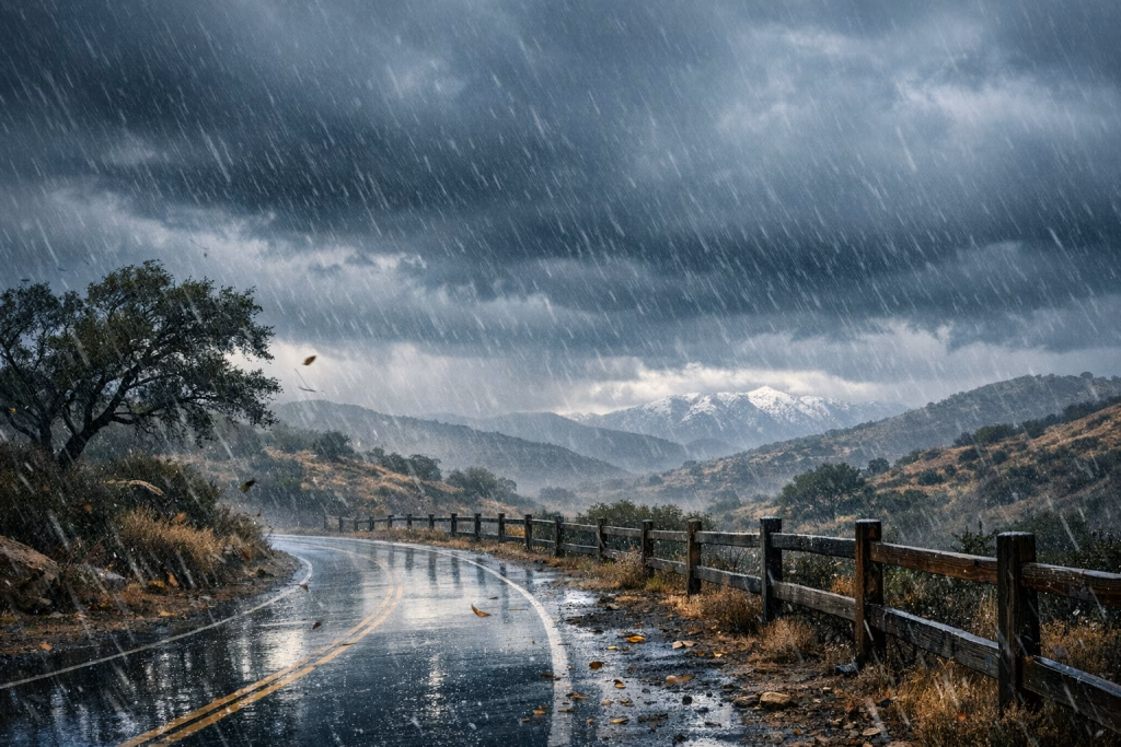
Real-World Use Case: From Weather Data to Campaign Visuals
Your source material also included a detailed weather log about heavy rain and storms in the San Diego area across 2025–2026. On the surface, it’s unrelated. In practice, it’s a perfect example of a marketing challenge: turning dense notes into visuals that communicate quickly.
How I’d turn that into assets
- Blog header image: a restrained, editorial-style rain scene with ample negative space for the headline
- Timeline graphic: three “storm events” panels with rainfall totals and dates
- Map-style visual: simplified, clearly labelled regional comparison (only if you can verify geography and totals)
This is where a model with better layouts matters. You can convert a text-heavy story into a set of clean visuals that readers actually absorb. And yes, I’d still verify any numbers before putting them into a graphic—because once a number is on an image, it travels far and keeps travelling.
SEO Targeting: Keywords and On-Page Structure You Can Use
If you want this topic to rank, you need to match how people search. From what I see in B2B marketing circles, the likely keyword themes include:
- ChatGPT Images 2.0
- AI image model for marketing
- AI image editing for ads
- Automate marketing creatives with make.com
- n8n AI content automation
On-page, I’d keep these best practices tight:
- Use one clear H1 (done here)
- Use descriptive H2/H3 that match search intent (workflows, editing, layouts, automation)
- Add internal links to related posts (automation, make.com scenarios, n8n templates, prompt writing)
- Optimise images with alt text and compression
Implementation Plan: How You Can Roll This Out Without Disrupting the Team
I like phased rollouts because they reduce drama. If you try to replace your entire design process in a week, you’ll create pushback and sloppy work. Here’s a calmer approach.
Phase 1 (Week 1–2): Controlled experiments
- Pick one channel (e.g., blog visuals or internal deck imagery)
- Set a style guide in plain English
- Run the edit and consistency tests
- Track time saved and revision counts
Phase 2 (Week 3–4): Add automation with a review gate
- Build a make.com or n8n flow that generates drafts
- Route outputs to a review board
- Store approved assets with tags and naming conventions
Phase 3 (Month 2): Expand to paid social and sales enablement
- Add variant generation and multi-size exports
- Create templates for recurring needs (webinars, product launches, newsletter banners)
- Measure performance impact: speed, volume, and campaign results
In my experience, this phased method gets you adoption without spooking your designers. Good designers usually like tools that remove repetitive work. They just don’t like tools that pretend judgment is optional.
Common Pitfalls (So You Don’t Step on the Same Rake I Did)
I’ve seen teams repeat the same mistakes with every new AI tool. Avoiding them gives you a head start.
Pitfall 1: Treating prompts as a one-off
Prompts are process assets. Version them, store them, improve them. If you don’t, you’ll re-learn the same lessons every Monday.
Pitfall 2: Skipping naming conventions and metadata
If you can’t find assets later, you didn’t save time—you just shifted the cost into future confusion.
Pitfall 3: No clear “definition of done”
Decide what “usable” means (sizes, brand, safe space, QC). Otherwise stakeholders will move the goalposts every time.
Pitfall 4: Publishing without human review
Even a small review gate saves you from preventable embarrassment. I’m saying this as someone who enjoys automation a bit too much.
What to Watch Next
As ChatGPT Images 2.0 rolls into more workflows, I’d watch for signals in three areas:
- Edit reliability: can you do targeted changes without losing the original structure?
- Series production: can you generate sets of coherent visuals that feel like one campaign?
- Operational fit: does it plug into your review, storage, and distribution processes cleanly?
If those hold up, the biggest benefit won’t be “cool images.” It will be a calmer, faster production cycle—less last-minute scrambling, more consistent output, and fewer awkward compromises.
Next Steps: How I’d Help You Apply This
If you want to use ChatGPT Images 2.0 in a serious marketing setup, I’d start by mapping your asset lifecycle: where requests come from, where approvals happen, and where things get stuck. Then we’d build one automation in make.com or n8n that produces drafts, routes them for review, and saves approved outputs into a tidy library.
You don’t need a giant overhaul. You need a workflow you can trust on a busy Tuesday.