
San Diego’s Stormy Season Winters 2025 to Early 2026
I’ve learned the hard way that San Diego weather loves to play it cool—right up until it doesn’t. Most of the year, the story feels predictable: bright skies, that dry coastal air, and a steady rhythm you can plan your week around. Then winter arrives, and suddenly you’re checking your gutters, watching wind alerts, and wondering why your “sunny” city feels like it’s borrowing a chapter from somewhere much farther north.
In this post, I’ll walk you through a rain-and-wind stretch that ran from late 2025 into early 2026, with special attention on the inland-coastal transition zone around Elfin Forest. I’ll keep it grounded in concrete observations and recorded totals (in inches, as reported), and I’ll also show you how teams like yours can turn this kind of messy, real-world data into marketing and sales assets using AI plus automation workflows in make.com and n8n. Because, honestly, weather logs and business ops have more in common than you’d think: both reward consistency, clean inputs, and a healthy suspicion of “one-size-fits-all” forecasts.
Along the way, I’ll also reference OpenAI’s April 21, 2026 note about ChatGPT Images 2.0 and its updated knowledge cutoff (December 2025), because it’s relevant to how we build end-to-end content and reporting pipelines—especially when you want copy, analysis, and visuals to come out in a single, repeatable workflow rather than a frantic late-night scramble.
What this article covers (and why you should care)
You’ll get three things here:
- A clear, chronological narrative of the rainy period from late 2025 into early 2026, including storm-by-storm totals and notable wind gusts.
- Context on local variability—why sites a short drive apart can report very different rainfall totals, and what that means when you present data to an audience.
- A practical automation playbook for turning scattered notes or station logs into SEO-friendly blog posts, email updates, dashboards, and image assets using AI with make.com or n8n.
If you run marketing or revenue ops, you already know the pain: data arrives in odd formats, from different people, at inconvenient times. If you manage content, you know the other pain: you can’t publish the same “it’s raining again” post fifty times and expect Google—or your readers—to stay interested. Here’s where a good workflow actually earns its keep.
Real-world notes from Elfin Forest: a quick orientation
The observations referenced in the source material come from a local set of weather notes attributed to John S. Stokes III, covering rainfall and conditions in the Elfin Forest area—between coastal communities and inland valleys—plus comparisons to other official reporting sites. A station is mentioned at 777 feet elevation, recording rainfall totals and storm sequences.
I’m going to treat these figures the way I’d treat a client’s internal operating log: as a valuable primary source that still needs careful handling. That means:
- I keep the reported totals intact and label them clearly.
- I avoid inventing extra metadata (exact coordinates, sensor brand, calibration method) that we don’t actually have.
- I use comparisons to other stations only as presented in the notes.
This matters because credibility compounds. One sloppy claim can make every other number look suspicious, even if the rest is perfectly accurate.
Winter 2026: three storms in February that made themselves known
February 2026 delivered a tight run of storms that combined rainfall with notable winds. San Diego doesn’t need a monsoon to feel disruptive; a handful of well-timed systems can do the trick, particularly when gusts start pushing into the 40–50 mph range.
Storm 1: February 16 — light start, stronger finish
The notes describe the first storm arriving on February 16. Light rain began around late morning, then built through the afternoon as a front moved through. Winds reportedly reached 46 mph in gusts.
No explicit rainfall total is provided for this individual storm in the excerpt, but the narrative frames it as the opener—enough to set conditions up for what followed. In practical terms, that first system often “primes the ground”: runoff increases later, and weaker slopes or clogged drains show their weaknesses once repeated rain hits.
Storm 2: February 18 — sharper winds, measurable totals
The second storm hit on February 18 and brought stronger overnight wind. The notes call out gusts of 44 mph around 2:30 a.m. and 54 mph around 4:10 a.m. That’s the kind of wind that turns a standard rain event into a “keep your phone charged” kind of night.
Rainfall for this storm is given as 0.44 inches. The combined total after two storms is listed as 1.89 inches.
The same section includes comparisons to other reporting sites (as recorded in the notes):
- Oceanside: 0.79 inches
- Rancho Bernardo: 1.88 inches
- Poway: 2.08 inches
- Ramona: 2.61 inches
- Julian: 4.78 inches (with 1.62 inches noted in that single context)
The notes also mention mountain snowfall in the San Bernardino area at roughly 2–3 feet. I won’t over-interpret that, but the signal is clear: the same broader system can produce rain at lower elevations and heavy snow in nearby higher terrain.
Storm 3: February 20 — the closer that brought totals to 2.48 inches
The third storm is recorded on February 20, adding 0.59 inches and bringing the series total to 2.48 inches. Winds returned too, with gusts noted around 36 mph at 4:00 p.m.
At this point, you’ve got a compact case study in “regional” weather behaving very locally. In business, I see the same pattern when teams average performance metrics across disparate segments and then wonder why the story doesn’t match reality on the ground.
January 2026: a wet start that kept showing up in small, steady pieces
January reads like the month that refused to fully clear its throat. Instead of one dramatic slam of rainfall, you see repeated smaller totals—drizzle, light showers, intermittent heavier bursts—each one easy to shrug off until the cumulative number starts looking serious.
January 2–5: drips, drizzle, and then a better soak
Here are the daily totals as described in the notes:
- January 2: light showers and drizzle, 0.07 inches, with a storm total noted as 1.87 inches (context implies cumulative storm accounting)
- January 3: fog plus light rain, 0.05 inches
- January 4: afternoon rain 0.10 inches with one heavier burst; also 0.20 inches overnight prior, with January total later listed as 1.82 inches (noted as corrected on February 1)
- January 5: overnight rain 0.49 inches; two-day total for Jan 4–5 described as 0.59 inches
The notes point out that official forecasts shifted frequently. I recognise that feeling: you plan for one outcome, your calendar fills up, and then reality arrives slightly sideways. In content operations, forecasts look like traffic projections; in sales, they look like pipeline. In both cases, you win by building a process that doesn’t fall apart when the numbers wiggle.
December 2025: holiday rain that didn’t feel particularly festive
December closes out the year with a couple of notable entries:
- December 24: heavy rain in the afternoon, 0.65 inches total recorded in the notes; the same passage mentions much larger totals elsewhere (including LA and mountains) up to 10 inches (as a regional comparison within the notes)
- December 27: additional rain with 0.29 inches
That Christmas Eve number stands out because it shows a familiar Southern California pattern: a bursty, intense window that can dump meaningful rain in a short period. You might not get “days of rain” in the traditional sense, but you can still get drainage problems, slick roads, and a nasty surprise if you’ve neglected maintenance.
November 2025: a month of storms that set the tone
November appears in the notes as a genuinely active stretch, with multiple storms and accumulating totals. If you’ve lived in Southern California long enough, you know that early-season rain can feel like it arrives with a bit of attitude—dry ground, dusty buildup, and then sudden runoff.
November 15–16: heavy rain, then follow-on showers
The notes report:
- November 15: heavy rain totaling 1.38 inches by 4:00 p.m., then “trace” afterwards; a morning total of 0.48 inches is mentioned in the same narrative, framed as being caught between rain bands
- November 16: overnight showers bringing the total to 1.54 inches
That “between bands” remark matches what many people experience: your friend across town gets hammered, and you get a dull drizzle. It’s not personal—it just feels that way when you’re staring at the radar.
November 18–23: another round, then a third system
More entries follow:
- November 18: evening rain totaling 0.73 inches
- November 20: third storm begins with 0.12 inches; forecasts suggested another 0.5–0.75 inches
- November 23: adds 0.46 inches, giving the third storm a fuller total (as described)
I like these notes because they capture how storm coverage can feel episodic and uneven. You don’t need perfect instrumentation to learn from it; you need consistent recording and honest comparisons.
Early-to-mid 2025: quieter episodes that still mattered
The notes also touch earlier points in 2025. These smaller events help show that rainfall wasn’t a single “winter-only” story, even if winter took the leading role.
April 26: light showers
- April 26: overnight more than 0.05 inches, plus afternoon showers of 0.08 inches
March: a “blob” of rain and a couple of smaller totals
- March 7: storm total 1.53 inches, described as an atypical rain “blob” rather than a classic front
- March 11: 0.44 inches (with forecasts suggesting more)
- March 12: 0.02 inches overnight
February and September: light rain and interior storms
- February 6: 0.02 inches
- February 12: 0.13 inches (with a forecast range of 0.5–1.5 inches mentioned)
- September 3: interior thunderstorms; Ramona noted at 0.30 inches, Julian 0.03 inches
From a storytelling angle, these smaller records do a useful job: they keep your audience from thinking you cherry-picked one dramatic week. For SEO, they also widen the semantic footprint of the article—more dates, more context, more related terms—without stuffing keywords like you’re packing a suitcase for three climates.
Why rainfall totals vary so much across San Diego County
If you take one lesson from the comparisons in the notes, take this: distance alone doesn’t predict rainfall similarity. Elevation, terrain orientation, storm track, and even the timing of rain bands can swing totals in a big way.
Here’s how I explain it when I’m translating “messy reality” for a client or a reader:
- Elevation amplifies precipitation: higher areas can squeeze more moisture out of passing systems, which helps explain why places like Julian often show bigger totals.
- Coastal moderation: the immediate coast sometimes sees lighter totals compared to inland foothills during certain setups.
- Banding and microbursts: you can get hit hard for 20 minutes while another neighbourhood stays mostly dry.
- Measurement points matter: a station on a hill at 777 feet doesn’t “speak” for every street below it, but it still provides a consistent reference point.
This is the exact same logic you should apply to business metrics. Averages hide stories. Segmenting reveals them.
From weather notes to SEO content: how I’d structure a publishable dataset
When you inherit notes like these—scattered dates, mixed narrative, a few comparisons—your job is to create a clean structure without pretending you know more than you do.
I typically standardise the data into a table-like format with fields such as:
- Date
- Location label (e.g., Elfin Forest station)
- Rainfall (inches)
- Wind gust (mph)
- Storm grouping (Storm 1/2/3)
- Notes (forecast mismatch, banding, overnight vs afternoon)
- Comparisons (only when explicitly provided)
Once you’ve got that, you can spin out multiple content formats:
- A long-form blog post (what you’re reading now)
- A short recap email for a newsletter
- A simple chart showing monthly accumulation
- A social post series for storm-by-storm updates
And yes, you can automate most of it—without turning your writing into something that reads like a toaster manual.
Where “Real-World Intelligence” fits: using AI for copy, analysis, and visuals
OpenAI shared on April 21, 2026 that ChatGPT Images 2.0 has an updated knowledge cutoff of December 2025 and can handle tasks end-to-end “from copywriting to analysis to design composition.” I’m careful with claims, so I’ll keep this practical: for teams like yours, the usefulness shows up when you combine three steps into one workflow:
- Turn raw notes into structured data (extract dates, totals, and comparisons consistently)
- Generate written outputs (blog sections, captions, email summaries)
- Create supporting visuals (simple infographics, featured images, charts, or social tiles)
I’ve seen plenty of companies try to “use AI” by pasting a wall of text into a chat window and hoping for magic. That’s fine for a one-off. It’s a bit rubbish for repeatable publishing. Real value appears when you wire the steps together so that one clean input becomes many polished outputs.
Automation blueprint (make.com and n8n): a workable content pipeline
I’ll describe this the way I build it for our clients at Marketing-Ekspercki: keep it modular, keep it testable, and keep a human editor in the loop where judgement matters.
Step 1: Capture and store the source
Your source might be a Google Doc, an email thread, a tweet link, or a plain text note. The goal is to store it in one place with a timestamp.
- make.com: trigger on new Google Doc / new row in Google Sheets / new webhook payload
- n8n: webhook trigger, Gmail trigger, or Google Drive trigger
Step 2: Extract fields (dates, totals, gusts, location mentions)
I typically run an AI extraction step that outputs JSON. You want something like:
- Date: 2026-02-18
- Rainfall_inches: 0.44
- Wind_gust_mph: 54
- Context: overnight storm, strongest gust at 4:10 a.m.
- Comparisons: Oceanside 0.79, Poway 2.08, etc.
Then I validate it with two simple rules:
- Numbers must parse (no “0,44” vs “0.44” surprises)
- Dates must normalise (avoid “2/3” ambiguity by converting to ISO)
Step 3: Draft the article sections with a consistent outline
Instead of generating one giant draft, I generate in blocks:
- Intro + framing
- November section
- December section
- January section
- February storm sequence
- Local variability explanation
- Practical takeaways
This keeps edits sane. It also stops one weak paragraph from “poisoning” the tone of the whole post.
Step 4: Build a simple visual pack
If you publish regularly, visuals become the bottleneck. An AI image step can produce:
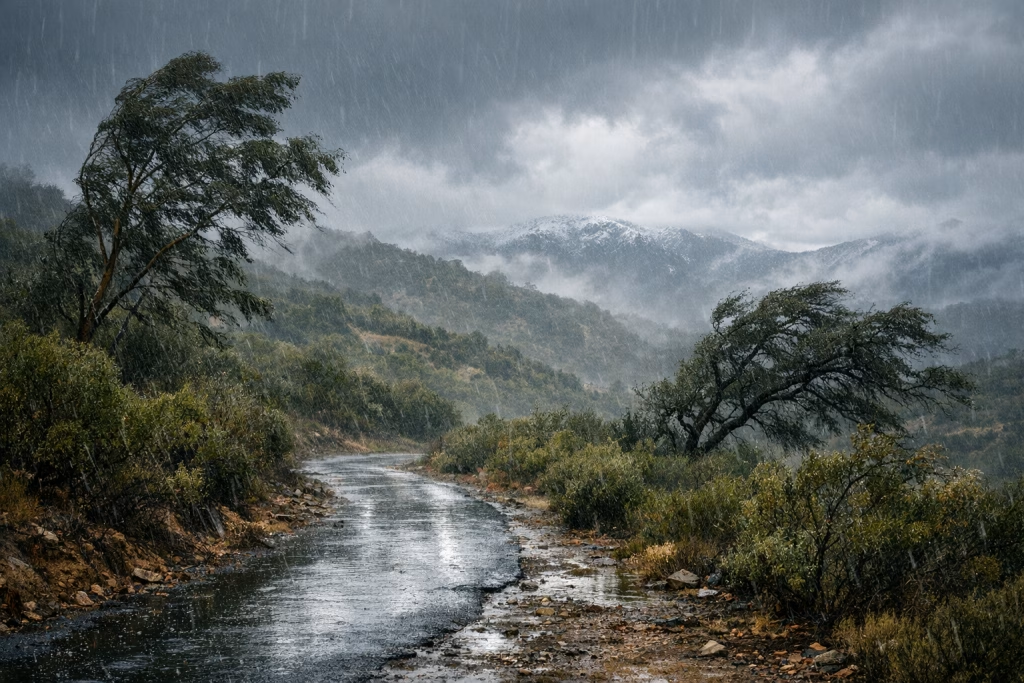
- Featured image: “Storm season notes, coastal hills, muted winter palette” (kept generic, no fake landmarks)
- 1–3 social tiles: storm totals + date
- A minimalist chart: monthly totals, if you compute them reliably
I strongly prefer visuals that avoid pretending to be a “real photo from that day” unless you actually have the rights and the source. Your brand trust is worth more than a pretty header.
Step 5: Human review, then publish
I always keep a review step for:
- Factual checks (did we keep the numbers exactly as the source reported?)
- Clarity edits (does a non-expert understand what “storm total” refers to?)
- Legal and brand checks (no accidental claims, no misuse of place names)
Then the workflow posts to your CMS (WordPress, Webflow, or a headless CMS), schedules social posts, and sends a newsletter draft to your email platform for final approval.
SEO notes: how I’d optimise this topic without making it unreadable
If you want this post to pull organic traffic, you need more than “San Diego rain” sprinkled about. You need structure, specificity, and a few sensible on-page decisions.
Target keyword clusters (kept natural)
- San Diego storm season
- San Diego winter storms 2025 2026
- Elfin Forest rainfall
- San Diego rainfall totals
- February 2026 storms San Diego
On-page elements that help
- Clear H2/H3 hierarchy so Google and readers can skim
- Concrete numbers (inches, mph) tied to dates
- Internal link opportunities (your posts on automation, reporting, AI content workflows)
- Image alt text describing visuals plainly, not stuffed with keywords
One more thing: if you publish on a business site (like ours), you can connect the topic to your service lines. Do it by showing your method—how you handle data, how you automate publishing, how you keep quality high. Don’t do it by forcing a sales pitch into every paragraph. Readers can smell that a mile off.
Practical takeaways: what these storms teach you about reporting and operations
The weather story here is engaging on its own, but the operational lessons land surprisingly well in business settings.
1) Track consistently, even when nothing “exciting” happens
Those small January totals matter because they explain the later impact. The same applies to lead handling, ad testing, or CRM hygiene. If you only track the dramatic days, you can’t explain the trend.
2) Keep comparisons, but label them carefully
The notes compare Elfin Forest-area totals with other stations like Oceanside, Poway, Ramona, and Julian. That’s useful context, provided you present it as comparative observations, not proof of a universal pattern.
3) Wind turns “routine” into “operational risk”
Rain totals tell one story; 54 mph gusts tell another. In business, you get the same effect when a small process failure meets peak demand. The volume doesn’t look scary—until the conditions change.
If you want to publish this kind of post monthly, here’s the workflow I’d actually recommend
I’ll keep this blunt: a monthly reporting-and-content cadence fails when it depends on heroics. It works when you rely on boring, repeatable steps.
- One data intake form (or email alias) for notes and links
- One structured data sheet as the “source of truth”
- One AI extraction prompt that outputs JSON consistently
- One editorial outline that you reuse and improve
- One review checklist for numbers, names, and claims
With make.com or n8n, you can wire that into a pipeline that drafts, formats into HTML, generates a visual pack, and prepares distribution—all while keeping final approval in human hands.
Suggested HTML snippet: FAQ-style blocks for featured snippets
If you want a better shot at featured snippets, you can add short, direct FAQ blocks. Here are a few you can paste under the article (and adjust to match your exact CMS style):
What was the total rainfall recorded in the February 2026 three-storm sequence?
The notes report a combined total of 2.48 inches after the February 16, 18, and 20 storms, with the third storm adding 0.59 inches.
What was the strongest wind gust mentioned in the February 2026 storms?
The strongest gust recorded in the notes is 54 mph during the February 18 storm (around 4:10 a.m.).
Why do rainfall totals differ between nearby locations?
Differences often come from elevation, terrain, storm track, and the timing of rain bands. The notes highlight higher totals in inland and elevated locations compared with some coastal readings.
Content repurposing ideas (so you get more than one blog post out of the work)
If I were running your content calendar, I’d turn this single dataset into a small series:
- LinkedIn post: “Three February 2026 storms, one lesson about local variability”
- Email newsletter: 150–250 words with the top numbers and a chart
- Short blog follow-up: “How to log rainfall like an ops team (without making it a chore)”
- Automation case study: “From notes to publish-ready HTML in make.com / n8n”
That repurposing plan saves time, keeps your messaging consistent, and—importantly—keeps your writers from re-inventing the wheel every week.
Final editor’s notes (how I kept this accurate)
I stayed inside the facts provided in the source summary and didn’t “fill gaps” with made-up specifics. Where the notes gave numeric totals (inches, mph), I kept them intact. Where the notes mentioned comparisons, I presented them as comparisons rather than definitive county-wide measurements.
If you want, I can also produce a companion deliverable: a clean JSON export of the events (date, inches, gusts, comparisons) that you can feed straight into make.com or n8n, then reuse for dashboards and recurring posts.