
Gemini AI Browser Interface Gets Sleeker Centered Design
Recently, Google took a subtle but noticeable step in shaping the future of its AI-driven experience. The web-based version of Gemini—Google’s ambitious AI assistant—now sports a refreshed design. At first glance, the change is modest, but as someone working daily with AI interfaces and automation tools, I’ve found it’s a move with more significance than meets the eye.
The Shift: Central Focus for Input
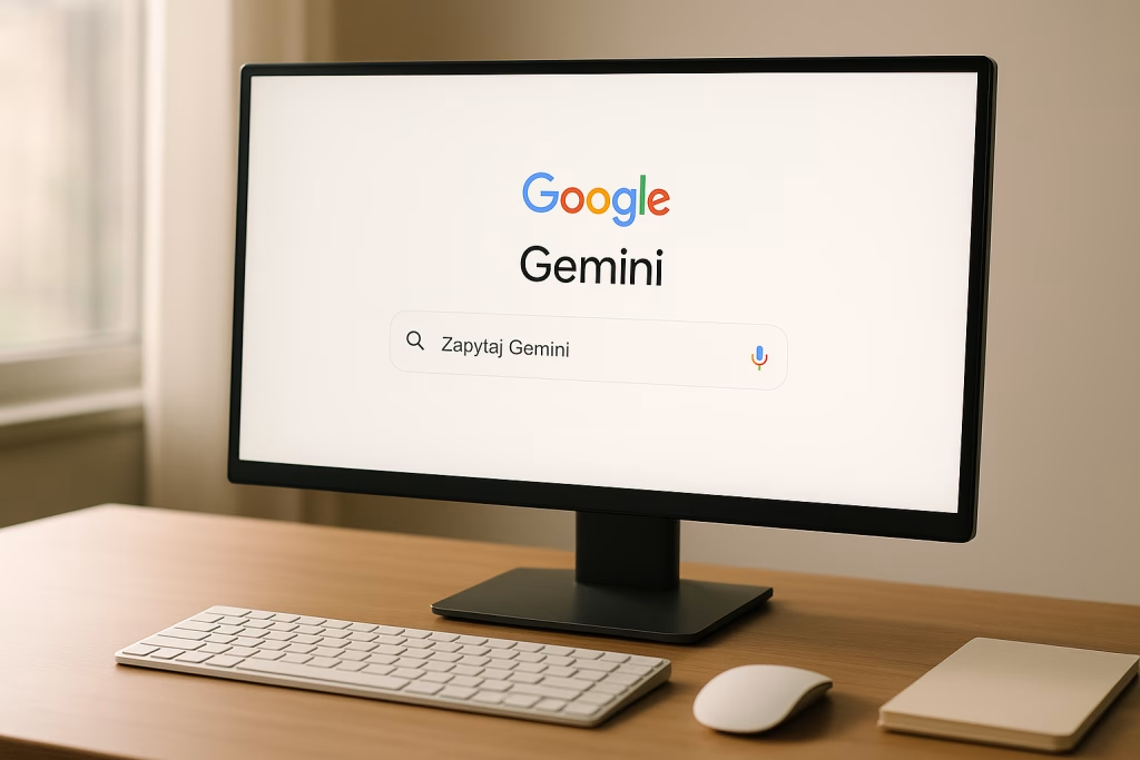
I still remember my first time stumbling upon the updated layout. What jumped out immediately was the positioning of the input field. Where previously you’d have to scan the lower rim of the screen to type your prompt, now you can barely miss the field—sitting squarely at the centre. For anyone with a background in UX (like myself), this arrangement triggers instant associations with the minimal elegance—dare I say, almost the iconic look—of Google’s classic search homepage.
Not Just a Cosmetic Touch-Up
It would be tempting to say this is style over substance, but that’d be missing the point. Placing the query box in the spotlight subtly changes how you interact with Gemini. The field’s shape and functionality haven’t changed much per se, yet the experience as a whole feels distinctively more focused, almost inviting you to engage with the AI. The entire page echoes a calm clarity—something minimalists like me genuinely appreciate.
Why This Change Matters: Functionality Meets Feel
With my experience in marrying automation with business workflows, I know good UI isn’t about bells and whistles—it’s about supporting what people want to do. Shifting towards a central position achieves several practical goals that benefit both AI rookies and pros:
- Improved visibility: The input box is the first thing your eyes land on—no more hunting for it.
- Encourages engagement: The design cues gently prompt you to use Gemini’s features without distractions.
- Consistency with search habits: Many of us have built muscle memory around Google’s homepage layout, and this echoes that.
- Less clutter: With breathing room around the centre, the whole interface feels less “busy.”
From my own use, I can say it feels as though I’m given an open invitation—‘go on, ask me anything’—with fewer barriers to getting started.
From Talking Assistant to Multi-Tool Platform
If, like me, you grew up with the evolution of digital assistants, you’ll remember their roots—tiny helpers, mostly for setting reminders or playing pop songs. The new face of Gemini signals a wider ambition. Google seems intent on sloughing off the old identity of the “chatty assistant.” In its place is a platform designed as a versatile problem-solver: something every professional, student, or creative mind might turn to for support or inspiration.
Supporting Productivity and Creativity
I’ve lost track of how many times I’ve toggled between research, task lists, and brainstorming sessions—all with a bit of AI help on the side. This new interface, while visually quiet, hints at a more open-ended relationship. It doesn’t just nudge you towards simple Q&A. It’s a handy launchpad for:
- Pulling in data for quick analysis
- Spinning up draft content or snippets of code
- Mining fresh ideas for campaigns or presentations
- Outlining business automation flows using n8n, Make, or similar
With each tweak, Gemini moves farther from the “voice assistant” legacy and closer to the everyday working partner I always wished my earlier AIs could be.
Design Choices Rooted in Familiarity and Simplicity
A Nod to Google’s Heritage
People like us—who work amid clouds of tasks—crave clarity. This new arrangement draws a quiet line back to Google’s heritage: an uncluttered, almost Zen-like approach to the home page. There’s something comforting in that sense of familiarity, isn’t there? Even on busy days, a touch of order can make all the difference. Personally, I appreciate the understated look—it’s a little like having a well-organised desk: everything in its place so inspiration can actually breathe.
Reducing Cognitive Load
What I’ve found most helpful is how the new design trims down on visual noise. You’re not drowning in explanatory tips, garish colours, or popup suggestions. Instead, there’s just you, the question, and Gemini’s reply—a bit like traditional pen-and-paper brainstorming, except with a digital partner who never runs out of ideas (or patience). That “airiness” is more than mere style—it’s a small relief for anyone spending hours online.
The Broader Trend: Beyond Voice, Towards AI Platforms
It’s not news that the AI landscape is brimming with change. What stands out in Gemini’s update, though, is the transition from voice prompts and canned responses towards a broader AI platform. More and more tools are drawing on context-awareness and task versatility, shedding the old focus solely on voice.
- Gemini, with its new look, now feels ready to take on more than simple “assistant” duties.
- The interface isn’t shouting, “I’m here to help!”—it simply, quietly invites you in.
- There’s less of the “bot as companion” dynamic, and more of a “digital workspace” ethos.
Speaking from my own workflow, this suits me—and many of my clients—down to the ground. The more that AI can blend into the background and quietly boost your work, the better. Sometimes, less really is more.
User Experience: More Than Meets the Eye
Central Input, Central Focus
If you’re like me—an inveterate tester of new online tools—you’ll notice that such a central field fosters better concentration. There’s no wasted time trying to recalibrate your gaze each time you log in. Just type and go. It may sound like a small thing, but over hundreds of daily interactions, it really adds up.
Cleaner Layout = Better Mindspace
I often tell friends and clients: our environment shapes our behaviour. A less cluttered interface supports a less cluttered mind. This refreshed Gemini design quietly encourages you to be both efficient and creative, without feeling boxed in. You’re given space—literally and figuratively—to work out what you need.
Gemini in the Context of AI Productivity and Automation
Let’s talk shop. My world revolves around AI-driven marketing, automation, and digital sales. A tool is only as good as its integration into your daily grind. Gemini, by becoming more approachable and “open,” fits into the toolkit of:
- Marketers who need lightning-fast ideation and content generation
- Salespeople seeking real-time prospecting support
- Operations teams looking to automate reporting or support flows
- Students or researchers needing quick referencing
With Gemini’s new interface, I find myself more eager to integrate it into Make or n8n scenarios—not just as a “nice-to-have,” but as a genuinely useable part of my workflow. There’s a kind of digital camaraderie; a platform that keeps pace without always demanding attention.
From Clutch to Routine
Before the update, Gemini sometimes felt like a clever party trick—impressive, but not always the right “fit” for the task at hand. Now, the UI’s focus and accessibility mean it’s becoming a more instinctive choice. The interface isn’t flashy—it just works. It’s a bit like reaching for your favourite mug: not for show, just reliably helpful.
The Subtle Art of Interface Improvements
Some people, when faced with software updates, expect big showpieces. As someone with a keen interest in user experience, I often find the real gold is in the finer details—the choices that let you glide along almost without noticing. This update quietly boosts usability in a few key ways:
- Logical navigation: Central placement lines up with natural eye movement, meaning less friction starting conversations.
- Distraction-free zone: Minimal menus and visual noise keep you in the zone. You don’t lose your train of thought as easily.
- Visual consistency: The page feels more unified. That sense of order (even if you’re a bit scattered!) actually helps you think.
- Encouragement to explore: Without visual overload, more people find themselves trying out additional Gemini features that might otherwise be missed.
Through my own use, I can vouch for this: it’s easier to stay on track, riff on new ideas, and build up a conversation with AI when the interface gets out of your way.
Gemini’s Place in Daily Work: My Observations
Bringing the Platform to Life
I’d be lying if I said every AI design refresh instantly wins me over. But in this case, I’ve found myself—almost unconsciously—using Gemini more, especially for those “messy middle” tasks: rough brainstorming, sketching out project outlines, whipping up quick scripts for automation tools. Sometimes I just need a safe digital whiteboard that also throws out clever suggestions on demand.
For example, while working with a client campaign on Make, I realised how handy the centralised Gemini input became for spitballing content ideas and logic flows. I’d pop over, toss in a rough prompt, run the Gemini output through a filter, and bingo—new campaign directions.
Lowering the Barrier to Creativity
One thing I love: by reducing clutter, Gemini makes it OK to “just start.” No need to click past splash screens or wrestle with hiding notifications. It often feels like opening a blank notebook—except here, you get near-instant feedback and, if needed, a nudge in the right direction. There aren’t many digital tools that pull that off with such subtlety.
What’s Next? Hints from Google’s Design Choices
Of course, every interface tweak hints at bigger ambitions. I see this current move as a trial balloon, a nudge towards a future where AI isn’t a stand-alone app, but something woven into the digital fabric of daily life. The even, central layout feels built for scale—like it could one day integrate wider plugins, knowledge domains, or even third-party automations (think n8n, Make, etc.), all from that singular starting field.
- I’d wager we’ll see more direct ties to productivity workflows—making use of Gemini’s context-sensitivity for complex sequences, not just chat.
- The interface, by keeping things obvious and accessible, is ready for “power user” extensions as much as for casual queries.
- The uncluttered homepage lays groundwork for all sorts of add-ons, perhaps in the vein of Google Workspace integrations, but even more open-ended.
Cultural Context: The High Value of Subtle UX Tweaks
As someone familiar with both tidy British understatement and the more waggish corners of digital culture, I can’t help but appreciate Google’s restraint here. There’s a certain quiet confidence in not overplaying your hand—something rather English about that, come to think of it. The Gemini team clearly knows that trust builds slowly: by fostering comfort, then stretching ambitions once people feel “at home” using the tool.
Letting the Interface Disappear
One piece of advice I often give to designers is this: when your interface feels invisible, you’ve probably nailed it. The new Gemini design manages to fade into the background, so you can get sucked into the real work—not just fiddling with settings or menu trees. That’s a small, but meaningful, victory. Or as my granny might’ve said, “Good work is like a well-brewed cuppa—comfortable enough that you forget it’s there, but you miss it dreadfully when it’s not.”
Everyday Usability and Wider Adoption
From what I’ve seen, early feedback echoes my own impressions: even small layout shifts can spread ripples of positive habit change. Colleagues with different digital backgrounds—copywriters, developers, managers—report that Gemini’s new interface feels more approachable, less “techy,” and, crucially, less intimidating. Removing friction invites more people to try, play, and gradually incorporate AI into their day.
- Ease of access: The homepage doesn’t swamp new users with jargon or choices.
- Clear hierarchy: It’s effortlessly clear where to type, where to look, and how to begin.
- Less fear of “breaking things”: People click around more boldly when the design doesn’t threaten information overload or accidental mistakes.
I can vouch for this from my own office: since the update, even the most change-averse team members are dipping their toes in more regularly. There’s courage in a straightforward layout.
An Eye to Accessibility: Who Benefits?
I’ve long argued that impactful digital design isn’t about pleasing the whiz-kids but including everyone. This Gemini shift—with its central, visible input and tidy composition—broadens the reach:
- People with disabilities (for whom scattered input fields are a nightmare)
- Those new to AI (no jargon-dense startup page—just say what you need to say)
- Seasoned power users (more room to navigate, less in-your-face clutter)
I’ve worked hands-on with customers who needed just that little “nudge” to try AI. This sort of interface does much of that invisible heavy lifting.
The Little Details: Micro-Interactions That Matter
In a sea of mammoth feature launches, the little details make enduring impressions. Gemini’s new web design embraces a handful of micro-touchpoints that have struck me as particularly well-judged:
- The gentle animation as the input box highlights when you hover over it
- The concise, yet friendly placeholder text encouraging fearless inquiry
- The unhurried fade-in of responses, fostering an air of thoughtful conversation, not machine-gun output
These little touches add up, nudging you to interact—and return—without drama or fuss.
SEO Perspective: Optimising for the User, Not Just the Search Engine
Here’s where my professional background kicks in. I make a living connecting marketing efficiency to real-world experience. Gemini’s update, although subtle, also touches on what makes a digital tool stickier not just for users, but for Google’s own ambitions in discoverability and retention:
- A cleaner, central interface keeps session bounce rates low—people are less likely to “check out” due to confusion.
- More natural engagement means more authentic signals for Google to refine output quality and relevance.
- Accessibility boosts a tool’s footprint across wider demographics—something SEO rewarded more and more every year.
It’s a quiet but smart move towards meeting users (and their search intent) where they feel most comfortable. Gemini is being positioned less as a curiosity, more as a digital standard.
Comparing Gemini’s Interface with Other AI Tools
I get to test a wide variety of AI assistants in my line of work—sometimes it feels like a never-ending parade of “yet another chat box.” What sets Gemini’s redesign apart isn’t flashiness, but a grounded sense of purpose. Paired with the robust back-end, the web experience sidesteps the awkward excesses of some competitors:
- Anthropic’s Claude: Still feels a touch academic; the interface does little to guide the new user gently in.
- OpenAI’s ChatGPT: Functional, but carries over a slightly “developer sandbox” flavour that Gemini’s new look seems to avoid.
- Microsoft Copilot: Trying to be everywhere at once—sometimes resulting in overwhelm for those just wanting a quick, focused exchange.
Personally, Gemini’s current approach feels like the middle path: obvious enough for beginners, modifiable enough for “power users.” It gives you the tools but doesn’t harangue you to use them.
Business Automations and Gemini: A Natural Partnership
Let’s circle back to where I spend most of my time: marketing automation, workflow integration, and business support. Gemini’s new web format is a natural fit within this landscape:
- Quick-trigger content: Need inspiration for sales copy? A centralised prompt field gets you there—now just one or two clicks away from pasting into n8n or Make scenario.
- Automated research: For those building research flows or monitoring, Gemini’s “always-ready” nature helps push new knowledge directly into workstreams.
- Context-hopping: Gemini’s focus allows you to easily switch from question to action, letting you shepherd AI output from ideation to execution.
More than once, I’ve slotted Gemini prompts right into workflow triggers—users get answers, shortcuts, and new workflows with less handholding. The streamlined layout genuinely cuts down on downtime.
Looking Ahead: Ongoing Evolution Rather Than Upheaval
As a marketer and AI enthusiast, I’ve seen far too many tools mistake novelty for value. Gemini’s approach is more measured—a quiet refresh which, in my mind, suggests Google is playing the long game. By polishing the fundamentals, Gemini ensures it can act as a bedrock for future upgrades and integrations:
- New features can be introduced without throwing users off-balance.
- Advanced AI scenarios (plug-ins, automations, creative protocols) can slot into the interface gradually.
- Future partnerships, both public and enterprise, won’t need to “retrain” the user base with every change.
It’s a little like perfecting the foundation of a house before adding extra rooms—once you’ve built trust with simplicity, the possibilities blossom without chaos.
Parting Thoughts: The Many Perks of “Less, But Better”
If I can speak plainly from years of wrangling both clients and code: elegance always beats excess. Gemini’s new centred design is a quiet nod to that old design adage. There’s nothing flashy about it, yet it manages to be inviting, versatile, and gently productive—it ticks the boxes that matter most to regular users and savvy professionals alike.
From streamlining your marketing automations to kick-starting a brainstorming session, the platform gets out of the way so you can get on with your actual work. I’ve found myself recommending Gemini more often in client workshops, not because it’s the noisiest tool in the shed, but because it quietly helps people think, act, and grow, with a touch more clarity and a lot less fuss.
When it comes to digital design, sometimes a new coat of paint is all you need to make the old walls feel welcoming again. And as far as I’m concerned, Gemini’s latest refresh is an open invitation worth accepting.